Monday, April 05, 2010
This one is for my Dad....
When I was young, one of the things my Dad used to say was, "Throw them in the Ocean!".
He used this phrase many times, when he would hear news of bad people doing bad things onto others, etc.,
My Dad's solution always seemed reasonable to me.
I generally have a pretty high tolerance for people, and will often give the benefit of the doubt, but lately, I've discovered my tolerance for stupidity has diminished.
I got very annoyed this afternoon after receiving an email.
As a way of tipping my hat to my Dad, I put this up as my status update on Facebook:

I feel better now.
(end rant.)
He used this phrase many times, when he would hear news of bad people doing bad things onto others, etc.,
My Dad's solution always seemed reasonable to me.
I generally have a pretty high tolerance for people, and will often give the benefit of the doubt, but lately, I've discovered my tolerance for stupidity has diminished.
I got very annoyed this afternoon after receiving an email.
As a way of tipping my hat to my Dad, I put this up as my status update on Facebook:
I feel better now.
(end rant.)
Labels: rant
Wednesday, January 27, 2010
"The iPad" - Really? That's the best name you could come up with?
worst. product. name. ever...
iPad?
Really?
This just goes to show that sometimes all of those brilliant engineers and marketing specialists just don't see the whole picture.
I'm pretty sure you could ask any woman on the street what the first thing she would think of when hearing about a product named "iPad", and she would say: feminine hygiene product.
I can guarantee you that (at least before Apple's announcement this morning) no woman who hears of a product called "iPad" would think, "Fantastic, computer gadget! I must get one now!"
No. that's not how it works.
Just say the word "pad" and our minds go elsewhere - somewhere much less fun and exciting.
I haven't even looked into the new iPad yet. I still can't get past the name.
But I'll tell you this, seeing the headline that Steve Jobs calls the iPad “truly magical” and a “revolutionary device” has a whole new set of connotations for me now. :)
Note to Apple: make sure you include smart women into those important meetings when you name those new "must-have devices"!
It just may stop you from sounding like an imbecile.
"The New iPad! Now with wings!"
update
No surprise: the net has been buzzing with iPad jokes all day.
Here's just one article about Apple's big goof:
Apple's iPad becomes big fat ‘intimate’ joke
Labels: funny ha-ha, just trina, rant, technology
Friday, December 18, 2009
Well, Cuss Me!
I've decided that I'm going to take a cue from the "Fantastic Mr. Fox" movie (which I loved, by the way. You should see it) and I'm going to use the word "Cuss" instead of any actual 4-letter cuss words when I feel the need to use expletives.
I generally don't swear much at all (except if I'm playing Xbox), but every now and then, I do feel the need. :)
Some examples:
"Cuss Me!"
"Are you Cussing Me?"
"Don't Cuss with Me!"
"What the Cuss?!"
...and my personal fave...
"Cluster Cuss"
(seriously - go see the movie!)
Why am I feeling the need to say this now, when it's been 2 weeks since I saw the movie?
It's because I just got home after spending the last 3.5 hours of my life sitting in traffic! "Cuss ME!"
I left Stockton at 3:00 this afternoon - hoping to beat the fog and the traffic (or, at least most of it). No go. There was a really bad accident of the big-rig nature in Stockton, and it took me 1 hour to get out. It should usually take about 15 minutes.
By the time I was in the Bay Area, I also got stuck in regular Friday night traffic, and Bay Bridge craziness.
It was bad.
Under normal circumstances, even with a little bit of traffic, it should only take 1.5-1.75 hours.
Oh, and did I mention that I stopped off at Tracy to grab a hot chocolate from Starbucks? Oh, and instead of putting in my one shot of peppermint, they decided to put in one shot of espresso instead. I try to avoid caffeine in general, and the hot chocolate was already pushing it, so by the time I made the discovery that it wasn't right, I was already at the Costco getting gasoline. I drove back to Starbucks to have them fix it. Good thing. That wouldn't have been pretty...
But I digress...
With my new, cleaner, cuss-free plan, I do believe that this blog is now officially rated PG-13.
It may even be PG...
Who the Cuss knows?
:)
Labels: funny ha-ha, just trina, rant
Thursday, May 14, 2009
Is this because I said that I wouldn't drink the Kook-Aid?
Oh, come on! How many Mac problems am I supposed to have in one week?
Ugh.
Has anyone else had this problem?
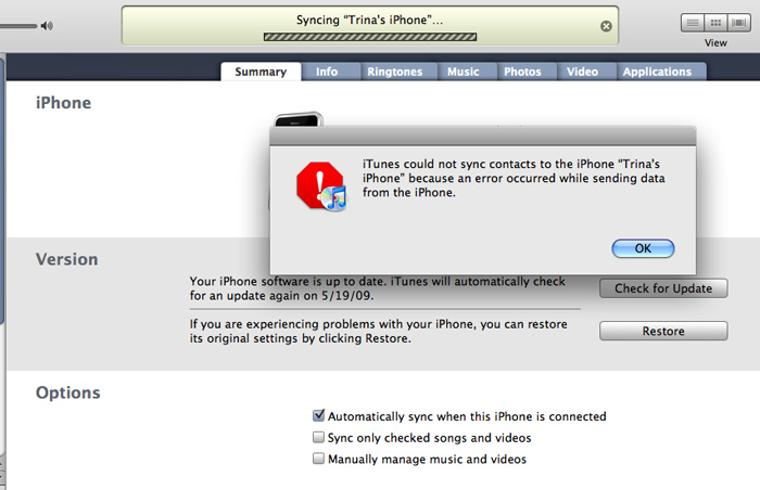
karma?
update
Well, that wasn't so bad.
found this article online, and tried the following fix:
I opened iSync in the Applications folder. (You can find that by clicking on the Finder, usually to the far left of the dock/toolbar at the bottom of the screen.) Then I went to the top of the screen and clicked "iSync", then "Preferences" then Reset Sync History. This totally solved the problem.
Ugh.
Has anyone else had this problem?
karma?
update
Well, that wasn't so bad.
found this article online, and tried the following fix:
I opened iSync in the Applications folder. (You can find that by clicking on the Finder, usually to the far left of the dock/toolbar at the bottom of the screen.) Then I went to the top of the screen and clicked "iSync", then "Preferences" then Reset Sync History. This totally solved the problem.
Labels: computers, geeks, rant, technology
"Hi, I'm a Mac, but here's one of the things that Apple doesn't tell you about..."
So, yes, I am a Mac. I've been using the Mac since 1984, and I've never owned a PC.
I'm a huge fan of Apple products in general.
With that said, I love my Mac, but I refuse to drink the Kool-Aid.
Over the years, I've learned that not all things Apple vs. PC are black and white. This probably has a lot to do with me becoming a little more open-minded and educated about the world of PCs from my hubby, who used to work at Apple, worked on Mac products for several years, is still a fan, but (gasp) has been using a PC for several years now.
Let's set the record straight:
Not all Macs/Apple products are fail safe, and without problems
and...
PCs are not the evil entities that they are sometimes made out to be.
It's just not that simple.
Case in point: I'm on my third Mac laptop. I had a Powerbook (Wallstreet) that I bought in 1999, G3 Powerbook that I bought in 2003, and my current MacBook Pro that I've had since June 2007.
This last MacBook Pro has had it's fair share of problems (which have all been documented on this blog). I've had to bring it in twice to have the hard drive restored, had the battery replaced, and needed two new logic boards.
I just got it back two days ago with the newest logic board.
Good news: it seems to be much faster now, which is fantastic, and the monitor issues have been fixed.
Bad news: (and here's what Apple doesn't tell you...)
When you've been using Apple's Time Machine to back up your computer routinely, but you need to send you computer in for a new logic board, when you get your computer back, it doesn't recognize your old Time Machine files.
Not that this is a huge deal. The easy solution is that you just wipe out your old Time Machine back ups, and start fresh. Meh.
But, isn't that what Apple and Time Machine are all about? Ease of use.
The problem with Time Machine is that it's so simple that it's very limited on what you're actually able to control. Basically, you can turn it off or on, and you can specify the location of the external drive that you want to back up to. Pretty limited.
Anyhow, I called Apple Support to see if there was some way that they could help me find some hidden settings somewhere in my preferences to link my computer back to my old Time Machine Files.
The first person I spoke to was very nice, and helpful in the sense that she passed me along to another person who was more of an expert in such things. He admitted that this is an ongoing problem, and that in all of the cases that he's had, he's never been able to successfully walk a person through the process over the phone. It's just too complicated. Why? because it involves opening a terminal window, and doing a bunch of UNIX programming to sort things out.
Many moons ago, I worked at Sun Microsystems and learned the very basics of UNIX. Probably not enough to get me through this, though.
He offered to find a computer repair store in my city where I could bring my computer and my external drive, and they could fix it relatively quickly for a small fee. Hmmm.. I asked why I couldn't go to the Genius Bar at an Apple store, and he said that I could, but that it would take a lot longer to get in, and the people helping me may or may not be able to complete this successfully.
Now, luckily, I just happen to live with one of the most brilliant computer scientists I've ever met, and he has plenty of experience in many computer languages, including UNIX. I told the Apple Care rep this, and he suggested that Dick do a google search to find some instructions on how to solve this problem using UNIX.
So, we did just that. Dick found this helpful site:
10.5: Repair Time Machine after logic board changes, read the instructions, took many notes, typed in a lot of code, and eventually got it all up and running.
For the record, I took a screen shot of the UNIX code that he wrote. Not that I expect anyone to read or understand it, but I wanted to point out how incredibly difficult this would be for the average Joe Mac User to be able to pull this off.

UNIX gobbily gook
If Apple/Mac is always tooting about how simple their products are supposed to be, how is it that this is the second time I've had this problem in just over a year? And, even if it's a complete fluke that I had to have a logic board replaced, why is it so difficult to point my computer back to my Time Machine files so that I can have access to my back up files again?
Don't believe the hype.
No computer brand is trouble free.
There are no perfect computers manufacturers.
There are no evil computer manufacturers.
Companies make computers, and they all have issues.
I'm a huge fan of Apple products in general.
With that said, I love my Mac, but I refuse to drink the Kool-Aid.
Over the years, I've learned that not all things Apple vs. PC are black and white. This probably has a lot to do with me becoming a little more open-minded and educated about the world of PCs from my hubby, who used to work at Apple, worked on Mac products for several years, is still a fan, but (gasp) has been using a PC for several years now.
Let's set the record straight:
Not all Macs/Apple products are fail safe, and without problems
and...
PCs are not the evil entities that they are sometimes made out to be.
It's just not that simple.
Case in point: I'm on my third Mac laptop. I had a Powerbook (Wallstreet) that I bought in 1999, G3 Powerbook that I bought in 2003, and my current MacBook Pro that I've had since June 2007.
This last MacBook Pro has had it's fair share of problems (which have all been documented on this blog). I've had to bring it in twice to have the hard drive restored, had the battery replaced, and needed two new logic boards.
I just got it back two days ago with the newest logic board.
Good news: it seems to be much faster now, which is fantastic, and the monitor issues have been fixed.
Bad news: (and here's what Apple doesn't tell you...)
When you've been using Apple's Time Machine to back up your computer routinely, but you need to send you computer in for a new logic board, when you get your computer back, it doesn't recognize your old Time Machine files.
Not that this is a huge deal. The easy solution is that you just wipe out your old Time Machine back ups, and start fresh. Meh.
But, isn't that what Apple and Time Machine are all about? Ease of use.
The problem with Time Machine is that it's so simple that it's very limited on what you're actually able to control. Basically, you can turn it off or on, and you can specify the location of the external drive that you want to back up to. Pretty limited.
Anyhow, I called Apple Support to see if there was some way that they could help me find some hidden settings somewhere in my preferences to link my computer back to my old Time Machine Files.
The first person I spoke to was very nice, and helpful in the sense that she passed me along to another person who was more of an expert in such things. He admitted that this is an ongoing problem, and that in all of the cases that he's had, he's never been able to successfully walk a person through the process over the phone. It's just too complicated. Why? because it involves opening a terminal window, and doing a bunch of UNIX programming to sort things out.
Many moons ago, I worked at Sun Microsystems and learned the very basics of UNIX. Probably not enough to get me through this, though.
He offered to find a computer repair store in my city where I could bring my computer and my external drive, and they could fix it relatively quickly for a small fee. Hmmm.. I asked why I couldn't go to the Genius Bar at an Apple store, and he said that I could, but that it would take a lot longer to get in, and the people helping me may or may not be able to complete this successfully.
Now, luckily, I just happen to live with one of the most brilliant computer scientists I've ever met, and he has plenty of experience in many computer languages, including UNIX. I told the Apple Care rep this, and he suggested that Dick do a google search to find some instructions on how to solve this problem using UNIX.
So, we did just that. Dick found this helpful site:
10.5: Repair Time Machine after logic board changes, read the instructions, took many notes, typed in a lot of code, and eventually got it all up and running.
For the record, I took a screen shot of the UNIX code that he wrote. Not that I expect anyone to read or understand it, but I wanted to point out how incredibly difficult this would be for the average Joe Mac User to be able to pull this off.
UNIX gobbily gook
If Apple/Mac is always tooting about how simple their products are supposed to be, how is it that this is the second time I've had this problem in just over a year? And, even if it's a complete fluke that I had to have a logic board replaced, why is it so difficult to point my computer back to my Time Machine files so that I can have access to my back up files again?
Don't believe the hype.
No computer brand is trouble free.
There are no perfect computers manufacturers.
There are no evil computer manufacturers.
Companies make computers, and they all have issues.
Labels: computers, geeks, rant, technology
Friday, April 17, 2009
Left Out

something is missing...
After I woke up this morning, I was doing my regular catch-up-on-the-internet-thing: looking through all my usual web sites: SFGate, MSNBC, Facebook, etc.,
I was just looking at my Facebook Home page, and noticed this silly poll on the side where the sponsored ads are.
Blonde, brunette, or redhead?
Um......
Hello?
I think you're missing an entire category!
This brought me back to an incident way back when I was in 2nd grade. My teacher was teaching us how to make graphs. She took a poll of "hair color" of all of the students.
Guess what?
In a class of 25+ students, I was the only one with black hair.
I distinctly remember this because, let's face it, when you're 7 years old, and the only Chinese kid in class, all you want to do is fit in with your peers. You're not looking to stand out.
But stand out, I did. Everyone had one column on their graph labeled "Black" and only one square on their full sheet of graph paper was colored in. The column titled "Blonde", "Brown" and maybe even "Red" were much taller than the one labeled "Black".
Come to think of it, I'm pretty sure I was the only non-Caucasian kid in the class. In case you're wondering, we were living in Fresno, CA at the time. Not exactly the Great American Melting Pot in the mid-70s.
That was more that 30 years ago, and yet, here I am looking at this silly poll on Facebook asking what hair color people prefer: Blonde, Brunette or Red.
You'd think we'd all come further than that by now.
Labels: just trina, rant
Saturday, January 03, 2009
It's not that I haven't been trying!
really, I have!
My blog has been down since New Year's Eve. Or, at least, that's the first time that I tried to publish a post, and it didn't work. I keep getting publishing errors due to some sort of javascript problems. I've done some research via blogger's discussion groups, and it seems there are others (though, apparently, not a majority) having this problem. It seems to only affect accounts who have their blogs hosted on their own domain names rather then on blogspot. Although, this is also not affecting everyone who hosts their own domains, as I've seen several friends who have been successfully publishing to their blogs.
I hope it'll be fixed soon.
Rather than wait until it's up and running again, I figured I could at least continue with my blog posts and hope they'll all be published when it's working again.
Hopefully, that won't be too long.
Monday, June 16, 2008
11,725 Duplicate Events

Roughly two weeks ago, I downloaded the latest Apple OS upgrade to MacDreamy.
Sometimes, this proves to be a very big mistake.
For the second time that I've done this over the past 6 months, this upgrade did something very, very bad to my calendar.
First of all, you have to know that I use the Calendar in Entourage as my main calendar. (I also use Entourage as my main email, contact and notes app.) I've been using one form-or-another of Entourage ever since I met Dick more than 9 years ago. (It used to be Outlook Express for the Mac).
So, let's remember: I have more than 9 years worth of data in this Calendar/Email program.
You can just see where this is going, can't you?
Here's where it gets loopy:
All was fine and well with me and my Entourage Calendar for the first 8+ years. We had a very nice relationship. I was able to track all of my events, birthdays, and my hours for various clients, and even got to color-code each one, which makes generating invoices much easier.
Last year, I bought my iPhone. One of the main reasons I wanted it was so that I could easily sync my calendar and contacts from my computer to my phone (and vise-versa).
In order to do this, I had to turn on Apple Sync to take my calendar events from Entourage and create a new calendar in iCal (Apple's calendar). This was fine: I had two copies of my calendar: the first one was in Entourage, where I managed everything in my handy-dandy-do-it-all program. It was continuously synced with a second version of my calendar in iCal, which talked to my iPhone.
In theory, this all sounds fine.
...until something goes wrong.
...and when it goes wrong, it goes wrong to the tune of 11,725 duplicate events!
What?!
Yep, for the second time in the last 6 months, after I installed an OS upgrade to MacDreamy, the calendar sync went into overdrive, and decided to duplicate, triplicate, quadruplicate, etc ALL of calendar entries from the past nine years.
This is where the nightmare began:
My first thought was to remove the duplicates manually from Entourage. I only focused on events from the last couple of years, just to clean it up. That took a couple of hours. That's when I realized how far back my calendar went, and the ridiculous amount of unnecessary data that was clogging up my computer.
Dick found a script written to take duplicate events out of Entourage. Brilliant, I thought! This should fix things up! After two days of running it (and rendering me unable to use Entourage at all) I had no idea how far at all it had gotten. I had to quit out of it so I could have access to my all-important email program again.
So, I went back to cleaning out my calendar by hand. I cleaned out about 5 years, figuring that was fairly substantial.
The next move: delete the Entourage Calendar Copy in iCal, then re-sync with the cleaned up calendar.
Dick ran through this step-by-step with me, because the last time I did this (a few months ago) I did it by myself, and the results were not good: it erased both of my calendars.
So, we deleted the calendar in iCal. Then we turned the AppleSync back on, and specifically told Entourage to sync to iCal, using the new data to create a new Calendar. Again, I have 9 years of data in my calendar - it took a while.
Once it was complete, I realized that it had AGAIN deleted all of my calendar events in both my iCal version AND my Entourage. I had no calendar events at all.
(insert: Trina Freaking Out here)
Luckily, I had been running Apple's Time Machine Application which makes back-up copies of all of your files.
We ended up deciding to restore the latest version of my iCal Calendar, figuring we could fix that, and eventually sync it back to Entourage. Dick warned me that I should probably stop using my Calendar in Entourage, and just start using iCal exclusively. He explained that this will probably continue to be a problem every few months, and that if I only used iCal, and take Entourage out of the equation, it would probably work just fine. I'm bummed because Entourage's Calendar is just so much more robust than iCal, and has so many nice little features that I use often.
Dick found (yet another) script online called "iCal Dupe Deleter" that we thought we'd try to get rid of all of the duplicate events in the iCal calendar.
Fine. Worth a Try.
Good news: it has a much better UI than the Entourage script - this one actually has a progress bar so you can see how far along it's going.
Bad news: It found a total of: 16,585 events in the calendar.
Of these, 11,725 were duplicates.
Good Grief!
This was last Monday afternoon. This script doesn't keep me from using any of my other programs, so I figured I'd just let it run it's course in the background until it was done.
Again, this was last Monday, June 9th.
Today is Monday, June 16th.
As of this moment, it has removed 6,851 duplicates. This is after running 24/7 for the past week.
At this rate, I'm hoping it'll be done by the end of this week, at which time I'll have to see if it worked, and I'll have to make some decisions.
In the meantime, I've been writing all of my billable client hours on a post-it pad on my desk. I also haven't been able to sync my iPhone to my computer for the past 2 weeks.
This is not the end of the world - I know it's better to have many-duplicates of my calendar info rather than having everything wiped out entirely. And I know it's just a calendar - there are worse types of data that could be wiped.
But still. I'm tired. At this rate, it'll take the entire month of June to get settled.
blech.
Saturday, June 14, 2008
still not impressed with the new SFgate.com
We took MUNI home today from the Embarcadero this afternoon. When we reached our station, we heard an announcement that there was an accident on the new T-Line, and that the line was shut down in the area of the accident.
It turns out that two MUNI Trains collided at 4th and King Streets - one T-Line and one N-Line.
I only just now found this out because I was scanning the news on MSNBC.com.
Mind you, I had just read SFgate.com, and didn't see anything about it there. I had to double check through all of the many headlines to make sure that I didn't miss it.
...the local SF news site doesn't have a thing about it, but the World News site does.
Not very impressive, is it?
Labels: rant, san francisco
Wednesday, May 28, 2008
Less is More
When web design goes very, very bad.
‹rant›
SFgate.com changed their design format again today. It's the second time they've done that within the last couple of months.
Here's the thing: I love sfgate. I visit it frequently each day. I like it because I'm able to skim the headlines easily - which are both local news as well as world news. It's easy and concise, and I can quickly decide which stories/headlines interest me the most.
Bad news: Change is Bad.
Over the course of the last two design changes, they've somehow managed to go from a site that was unique because it was quick, and easy to navigate site with local and world news to a news site that looks a whole lot like everyone else. They've gone from having one feature story with one photo and one column with headlines of mixed stories, and quick blurb about the story, to becoming just another news site with multiple feature stories, multiple sections and multiple headlines.
I liked it because it was a "local site". It focused on local things. It always included the important World News Events, and had a small column for 4 or 5 AP stories, but the rest of it was local news. I have a routine of going to sfgate for my local news, and msnbc.com for World/AP news.
Now, it looks like sfgate is trying to compete with all of the big news sites. It's going in a direction that goes against the very reason why I was such a fan to begin with.
They have a little "Give us feedback" link which is already filled with dozens of readers bashing the new design.
I've been a web designer for 11 years. My first rule of thumb when designing a site has always been: "Less is More". Keep it simple. Don't over design. Let the user find what they want easily. Don't muck up the site with too much content.
Why is that so hard?
(or maybe it's just me, because goodness knows there are a lot of over-designed web sites out there that make my eyes bleed.)
I'm hoping that the design staff at sfgate.com will read the feedback and take it to heart. Hopefully, they'll go back to (one of their) old design that set them apart from the other news sites.
update
Okay, I know that this is totally over the top, but I've just found two screen shots of the from sfgate.com - an old one from 2007, and the new version as it debuted today. I thought it would be interesting to compare them side-by-side.

sfgate: then and now
Look how much more content this new design has packed into it, and how much harder it is to read. Seeing them side by side like this really makes me wish they'd just go back to the old design.
Is there enough crap in that site for you?
Seriously, my eyes hurt just looking at it.
Get a clue, guys. This is bad design.
‹/rant›
‹rant›
SFgate.com changed their design format again today. It's the second time they've done that within the last couple of months.
Here's the thing: I love sfgate. I visit it frequently each day. I like it because I'm able to skim the headlines easily - which are both local news as well as world news. It's easy and concise, and I can quickly decide which stories/headlines interest me the most.
Bad news: Change is Bad.
Over the course of the last two design changes, they've somehow managed to go from a site that was unique because it was quick, and easy to navigate site with local and world news to a news site that looks a whole lot like everyone else. They've gone from having one feature story with one photo and one column with headlines of mixed stories, and quick blurb about the story, to becoming just another news site with multiple feature stories, multiple sections and multiple headlines.
I liked it because it was a "local site". It focused on local things. It always included the important World News Events, and had a small column for 4 or 5 AP stories, but the rest of it was local news. I have a routine of going to sfgate for my local news, and msnbc.com for World/AP news.
Now, it looks like sfgate is trying to compete with all of the big news sites. It's going in a direction that goes against the very reason why I was such a fan to begin with.
They have a little "Give us feedback" link which is already filled with dozens of readers bashing the new design.
I've been a web designer for 11 years. My first rule of thumb when designing a site has always been: "Less is More". Keep it simple. Don't over design. Let the user find what they want easily. Don't muck up the site with too much content.
Why is that so hard?
(or maybe it's just me, because goodness knows there are a lot of over-designed web sites out there that make my eyes bleed.)
I'm hoping that the design staff at sfgate.com will read the feedback and take it to heart. Hopefully, they'll go back to (one of their) old design that set them apart from the other news sites.
update
Okay, I know that this is totally over the top, but I've just found two screen shots of the from sfgate.com - an old one from 2007, and the new version as it debuted today. I thought it would be interesting to compare them side-by-side.
sfgate: then and now
Look how much more content this new design has packed into it, and how much harder it is to read. Seeing them side by side like this really makes me wish they'd just go back to the old design.
Is there enough crap in that site for you?
Seriously, my eyes hurt just looking at it.
Get a clue, guys. This is bad design.
‹/rant›
Labels: rant, san francisco, web design
Friday, March 14, 2008
Stupid DPT
yet another reason for me to be grumpy today!
Grrrr..
I'm Grumpy McGrumpster today.
Here's the thing. Dick and I both "rule followers". We follow the rules, we obey the laws - enough so that we actually joke about it. We won't cross the street if the little red hand is up. We don't jaywalk. We are good, law-abiding citizens!
Unless you talk to the SF D.P.T. that is. (Department of Parking and Transportation for you non-urbanites.) Apparently, Dick has been breaking the law for almost 4 years now.
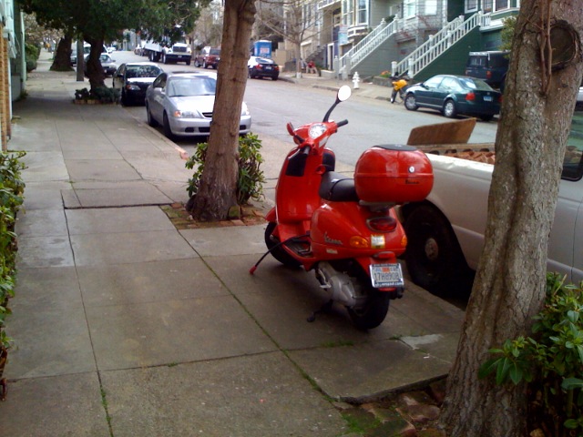
Dick has had his trusty Vespa Scooter for almost 4 years now. He always parks it in the same place: on the sidewalk between two trees, in front of our house.
Yes, that italicized part up there is your clue. It is, indeed, parked on the sidewalk. We've always felt that as long as it wasn't actually blocking the access of the sidewalk, that it should be fine. It's in between two trees. Unless someone is intentionally walking from one tree to the other, it's really not in the way at all.
Over the past 3 years, we've received about a ticket per year for parking it on the sidewalk. Dick took this in stride, figuring that a car on our block was actually blocking the sidewalk by parking across their driveway, and that they then have to do a full sweep of the block. That's okay. We knew we weren't being targeted.
Well, today, I noticed a meter maid writing up a ticket in front of our house. I went out to discuss the matter with her. She was very nice about it, and explained that "they" really started to crack down about a year ago. Any vehicle parked on any part of the sidewalk was to be ticketed - no matter if it's actually blocking the sidewalk or not.
Now believe me, I started to argue my case, as did a few people who walked by, but she explained it wasn't up to her, and that she was "just doing her job". She actually agreed that we weren't blocking anyone, and she had let it slide by several times, but she has started to get in trouble for such things.
The ridiculous part was that she told me that I "technically" could park it within 2 feet of my front property line, and that she wouldn't ticket it. So I argued that I could park it in front of my window, or in front of my stairs, clearly blocking part of the sidewalk, and that would be okay? She said yes, that she couldn't ticket us if we did this, but that we should use our common sense. Whatever. That's just stupid, and it goes completely against any kind of common sense.
You can see the left-most line in the sidewalk in the picture above - the one closest to the front of the house. She says we technically could park within that line, and that she couldn't ticket us. This is crazy stupid, because that blocks the side walk a whole lot more than parking between the two trees.
I tried really hard not to get angry at her. It's not her fault, and she's just doing her job, and she was actually being very sensible when trying to explain the "rules" to me that she had to follow. It also clearly wasn't going to help my case if I got upset.
But the thing is, I see this all the time: people flat-out blocking the path of the sidewalk with their big enormous cars parking across their driveways because they're too lazy to actually go out and find a spot on the street. I've seen people pushing baby strollers, and worse: people in wheel chairs who have to go into the street to go around the car across the driveway and sidewalk. This infuriates me.
I also raised the point that not only are we not blocking the sidewalk, but we're also not taking up an actual parking spot on the street, which apparently, is what we'll have to do, now. This is really brain-damaged (which seems to be my expression of the day).
I decided to leave the ticket on the scooter until Dick comes home today (he drove to the train station, because it was supposed to rain today) so we won't chance getting another ticket from another meter maid. When Dick comes home, I'll ask him to move it to a spot on the street. Or, maybe we'll just park it in front of our front steps. (that would be the bitter person in me coming out.)
This is ridiculous.
Oh, and by the way, the penalty for parking on the sidewalk:
$100.00.
Stupid DPT.
Labels: rant, san francisco
Quickbooks on the Mac vs. Quickbooks on the PC
I've been using Quickbooks Pro for the PC to do all of my business accounting since 2002. I only use it for writing invoices, and receiving payments. I really don't use it for much, but these two functions are very important for me to keep track of things.
A couple of months ago, I made the switch to Quickbooks Pro 2007 for the Mac.
My assessment so far:
Quickbooks for the Mac totally blows.
(how's that for a professional assessment?)
I just spent about 2 hours sending out invoices. It should have taken me about 45 minutes.
It's amazing to me how different the two iterations of the program are. I guess I shouldn't be surprised. I know how these things go: each iteration is written by a completely different group: like Office for the Mac versus the PC.
But really, this is really brain-damaged.
Sending out invoices was always very easy and fast of the PC version. I'd write out the invoices, and send them out in batches. I could even have a standard "email body" that went onto each email, with correct customer name placed in the appropriate field. It was all very fast and simple. After writing the invoices out, sending as a batch took less than a couple of minutes.
Not on the Mac.
I have to send out each invoice individually, and send it as a large monster-sized PDF file. The PDF file is 1.7 MB, versus the size of the PDF files that I sent on the PC, which was 35 K. That's a HUGE difference. If I were a client of mine, I'd be wondering why the file has to be so large. That's ridiculous, and I look like a Lame-O.
There are a bunch of other features that don't exist in the Mac version. There are a bunch of things that just don't "work". There are so many things that I've come across that just take so much more time than they should.
Considering I only use this program to generate and send out invoices, and to record payments, I'm really amazed at how much I'm missing from the PC version. I feel lucky that I don't rely on this program for more. I'm so very unimpressed.
Boo on you, Intuit.
Labels: geeks, rant, technology
![]() &
&
![]()
Disclaimer
The opinions expressed herein are my own personal opinions and do not represent my employer's view in anyway --- oh right, I *am* my own employer!
;)
© Copyright 2003-2007, Trina Chow